Objective: Wonder Cup is a menstrual cup. The product had to stand out in a sea of cups and create a brand identity that is different and distinct from the competitors, to create a fun and easy to understand manual and attractive box packaging.
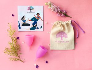
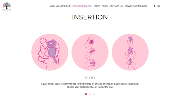
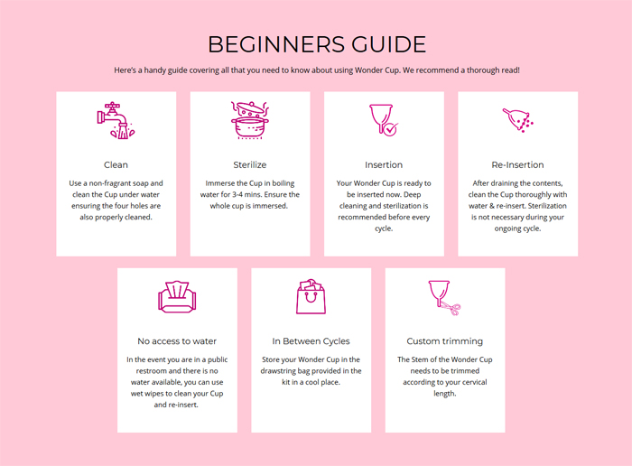
We started with writing manual content that was crisp, informative, easy to understand, not-so-technical and fun!
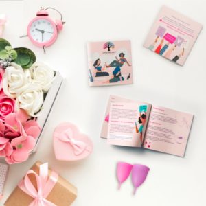
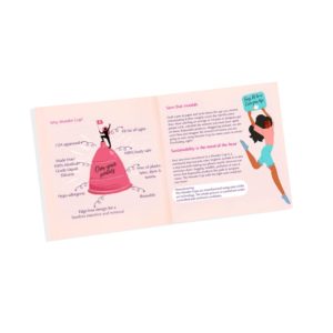
Our main aim being that whoever – whether a first-time user of menstrual cup or a tampon user or a young user who just started menstruating, picks up the product should feel comfortable and not intimidated by the product. Feminine colors, fun graphics & an uber-cool magazine like design makes it easy for a woman to pick it up and read through.
#DidYouKnowPackaging design is the first-impression the brand creates in-person. It takes about 7 seconds for a product to create a first impression on the average customer.Packaging influence is subconscious.
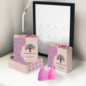
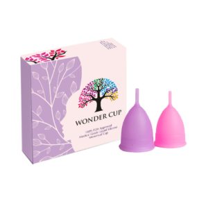
For the packaging, the colors used in the box are soothing, feminine and chic.In no way does the box represent some medical product look, it is kept attractive and has all the necessary information one needs on the box.
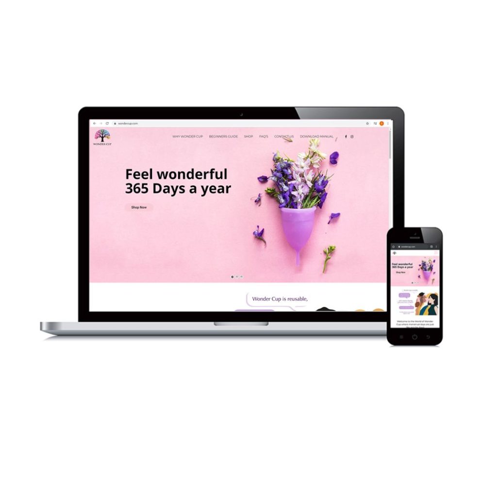
The website was designed in sync with the box and the manual with a UI that’s friendly and easy to navigate. It’s trendy with an intuitive design and user experience. The content is concise and supported with visuals and appealing photographs.
Wonder Cup had a global launch and entered the feminine hygiene industry with a bang.To make a distinct brand identity that stays on with consumers for long was surely a herculean task but we pulled all the stops and got the product to jump off shelves!
Manual & Packaging designing, Website Design & Development, Product Photography and Content Solution services were provided by Inkspire Media.With premium yet fun box-packaging, witty and informative content on website and manual, we rolled out the red carpet for women to trust a new brand for their most intimate function.